I decided to re-edit my music video to create a more successful outcome. I changed the plot to include more repeats of sections of footage, which added familiarity to the story and make it less ambiguous. In the re-edit, when it reached the factory, I used the roll effect on shots of the doll, and then showed flashes of previous images (as if the 'creature' has decided it doesn't like its new surroundings and has chosen to leave instead). I ended the video with the same shots of the flashing lights on the trees (as at the beginning) to give the idea that the 'creature' has returned to its planet.
I really took into account the musicality of the song and matched the imagery to the beat of the music in order to conform with one of the most important conventions of music videos. For example, at the beginning I used jump cuts between the images of the moon and the trees which changed on the beat, rather than having a long fluid take.
I also included much more effects in the re-edit. For example, I used a wave warp on the establishing shot of the landscape, which followed the melody of the song. I also added a zoom effect on the shot of the rocking horse in the park, which acted as a transition into the next shot.
I made the cuts between shots much quicker to add to the pace of the video, rather than having long takes. I also tried to make the surrealism of the plot much more apparent, as this was my original intention. Therefore, I particularly focused on incorporating repeated shots of the eye and doll, which I feel successfully gave the video a strange vibe.
Friday, 2 April 2010
Combination of All Products
After receiving feedback from my target audience, I found that they appreciated the combination of the Digipak and advert and felt that they fit the genre of music well. However, I received much more negative feedback for my video, as they felt it was too ambiguous and slow-in-pace to be a successful music video.
Therefore, I have decided to re-edit my music video in order to be more fast-paced and intresting, and so make the combination more succinct.
Therefore, I have decided to re-edit my music video in order to be more fast-paced and intresting, and so make the combination more succinct.
Thursday, 1 April 2010
Finished Music Video
Basic Plot:
An other-worldly creature lands on Earth and explores the environment surrounding it. As it observes the natural beauty, it soon becomes clear that a negative influence has taken affect on the world – humanity. As the video progresses, we see this influence become more and more dominant (polluting factory, problems with alcohol etc), until eventually the creature leaves to return to its own planet.
I used Adobe Premiere Elements to edit my music video. I cut down my footage using the razor tool and added a number of effects to make it more interesting. For example, I added a greyscale overlay, which then cut to colour using a short fade in between to make it look as if the "creature" was blinking. I also used a slow-motion effect on the scene in the busy high street, and tried to keep the cuts between scenes in-time with the music as this is a typical convention of music videos, whereby the imagery links to the musicality of the song.
I was generally pleased with the outcome, however I did receive some feedback from my target demographic which they thought could have improved the video. For example, they felt that certain scenes could have used shorter cuts to keep the video at a steady pace throughout. Also, although some people liked the surrealism of the plot, others found it quite confusing at times and interpreted it differently to how I had intended, so for future projects I would probably make the plot slightly less ambiguous.
Research into Existing Music Videos
Before creating my own music video, I researched existing ones on YouTube and the music channels, which covered a wide range of musical genres. Depending on the style of the band or artist and the feel of the music; the framing of the camera, the use of mise en scene, and the editing techniques also varied.
Particular examples I analysed included:
"Smack My Bitch Up" - The Prodigy
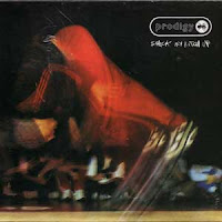
This particular video depicts a night out in the city filmed from a first-person perspective, portraying many controversial areas such as drinking and driving, snorting cocaine, violence, vandalism, sex and nudity. The protagonaist takes a stripper home, and once the stripper has left, glances in the mirror where it is revealed to be a woman. The video drew fierce criticism for misogyny despite its ending, and was accused of encouraging violence, especially towards women.
Although it is extremely controversial, I really like the way the video subverts politically correct stereotypes of this type of behaviour. Also, the composition of the camera in terms of it being shot from first-person perspective, and the editing techniques used, such as slow-motion sections, I felt gave it a much more unusual edge which I really wanted to emulate for my own video.
"Natural Blues" - Moby
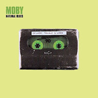
This video is a very unusual example of how important costume is within the mise en scene. It uses a series of pans and close ups to show a queue of elderly people waiting to die (almost like Purgatory), as well as a series of flashbacks showing memories from their lives. The video has subverted the typical use of a cameo of the artist by incorporating Moby within the plot. Using make-up and prosthetics, he has been made to look like an elderly man and is shown to be pushed in a wheelchair and observing other people in the queue and his surroundings.
The originality and style of the video were real attractions to me, as I felt they made the video much more intriguing and forced the audience to really think about the plot in order to interperet it in their own way. I wanted my video to follow the example of this unique style, which I think subverts the typical image we have of a music video: glitz and glamour, and makes it much more interesting to watch.
"I Believe in a Thing Called Love" - The Darkness
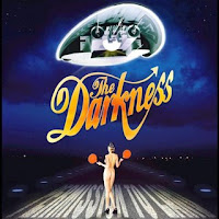
This example has adopted a space theme which runs throughout. It is set on a space ship and shows images of the band performing, rather than being purely narrative. The style of the video is a fun interpretation of the song and the genre of music, and demonstrates the personality of the band, particularly the lead vocalist, Justin Hawkins. Strange props have been used within the mise en scene which I feel gives the video real flare and makes it much more light-hearted. For example, there is a scene where Hawkins is being dried by a fluffy purple monster!
I like the use of the unusual props and the space theme also related well to the genre of music of my own song. However, the fact that it is performance-based, I think makes the video come across as quite generic, and I would prefer my own video to be more surreal and unique.
Particular examples I analysed included:
"Smack My Bitch Up" - The Prodigy

This particular video depicts a night out in the city filmed from a first-person perspective, portraying many controversial areas such as drinking and driving, snorting cocaine, violence, vandalism, sex and nudity. The protagonaist takes a stripper home, and once the stripper has left, glances in the mirror where it is revealed to be a woman. The video drew fierce criticism for misogyny despite its ending, and was accused of encouraging violence, especially towards women.
Although it is extremely controversial, I really like the way the video subverts politically correct stereotypes of this type of behaviour. Also, the composition of the camera in terms of it being shot from first-person perspective, and the editing techniques used, such as slow-motion sections, I felt gave it a much more unusual edge which I really wanted to emulate for my own video.
"Natural Blues" - Moby

This video is a very unusual example of how important costume is within the mise en scene. It uses a series of pans and close ups to show a queue of elderly people waiting to die (almost like Purgatory), as well as a series of flashbacks showing memories from their lives. The video has subverted the typical use of a cameo of the artist by incorporating Moby within the plot. Using make-up and prosthetics, he has been made to look like an elderly man and is shown to be pushed in a wheelchair and observing other people in the queue and his surroundings.
The originality and style of the video were real attractions to me, as I felt they made the video much more intriguing and forced the audience to really think about the plot in order to interperet it in their own way. I wanted my video to follow the example of this unique style, which I think subverts the typical image we have of a music video: glitz and glamour, and makes it much more interesting to watch.
"I Believe in a Thing Called Love" - The Darkness

This example has adopted a space theme which runs throughout. It is set on a space ship and shows images of the band performing, rather than being purely narrative. The style of the video is a fun interpretation of the song and the genre of music, and demonstrates the personality of the band, particularly the lead vocalist, Justin Hawkins. Strange props have been used within the mise en scene which I feel gives the video real flare and makes it much more light-hearted. For example, there is a scene where Hawkins is being dried by a fluffy purple monster!
I like the use of the unusual props and the space theme also related well to the genre of music of my own song. However, the fact that it is performance-based, I think makes the video come across as quite generic, and I would prefer my own video to be more surreal and unique.
Monday, 22 February 2010
Digipak
I created the template for the front and back panels of my Digipak. Once again, I scanned in my own illustrations and edited them using Adobe PhotoShop Elements.
Tools I used include the paint brush, the paint bucket, the clone tool, the polygon lasso and the eraser to create the same effect as on the advert. I also used the same uniformed colour background to inkeep with the continuity of the set of media texts.
I included the same font as before in order to add the band's name, the album name and the song titles.
I then added the copyright information to the bottom of the back panel, as well as the bar code and web address. I then created a music label name and logo and added that to the bottom to make the Digipak look realistic.
For the two inside panels, I used the photos I edited previously and layered them over each other. I made the inside panels much more simple to balance out against the more detailed outside panels which I think works well for the overall finished Digipak.


Advert for Magazine
I used Adobe PhotoShop Elements to create and A4 advert for a magazine to promote my Digipak. I scanned in my own illustrations and edited them using tools such as the paint bucket, paint brush, shadowing effects and clipping. I then filled the background to give the effect of a nightsky. I used a uniform look for the edited photos by using the same navy blue background, as well as the star-shaped paint brush I used previously.
I added text using the polygon lasso tool. The text related to the space theme to incorporate with the genre of music and the theme of my music video and its plot. Text I added includes the band's name, the album name, the release date and the act's web address.
Overall, I think the advert has turned out to be a success, as I have used my own drawings and I feel that they have been edited to a high standard.

Still Photos
I took photos of the band members in costume to use for the inside covers of my Digipak. I varied between midshots and close-ups of the two members and used different levels between them (for example, one standing and the other sitting etc).
I also took photos of headphones to relate to the dance genre or music and the band's name Galactic Express on a sign as it links to the genre of their music; dance.
Once I had uploaded the images, I began to edit them using Adobe PhotoShop Elements. I adjusted the lighting levels and increased the contrast levels to give each shot an unusual red tint. For the image of the headphones, I did the same except I added a purple/blue tint instead to add interest to the overall design.
Wednesday, 3 February 2010
Editing Song
I edited the track using Adobe Premiere Elements to make it a suitable length for my video. I did this by using the razor tool to crop sections of the song and clipped larger sections to do this. I was able to have seamless transitions between cropped sections and therefore a smoother sound.
I added a fade to the end of the song, so that the volume of the track would fade to nothing, rather than having a sudden finish. This adds to the eerie feel of the song and its video.
I added a fade to the end of the song, so that the volume of the track would fade to nothing, rather than having a sudden finish. This adds to the eerie feel of the song and its video.
Introduction to Adobe Premiere Elements
I started using a new program: Adobe Premiere Elements in preparation for my music video. Its functions include: adding numerous videos and audio clips to create layers with seamless overlays and adding effects to audio and visual clips (e.g: mosaic effects, fades, colour transitions, strobe lights...). Using this program, I will be able to edit the track I am going to use, and later add the video over the top of it.
Plot for Music Video
When listening to the song I am going to use for my music video, I had some initial thoughts and ideas as to what the plot could be. Some words and images came to mind including:
Dance, euphoric, utopia, gun shots, nighttime, robotic, scared to meet new people, alien, starship, eyes, galaxy, hysteria, Pet Shop Boys, Bloc Party, Sam Sparro, black & white/colour, fade.
This is the basic plot that came to mind:
- Point of view shots throughout (alien/robotic being?)
- Landing (dark lighting)
- Ramp of "spaceship"
- Delirious/strange contrasting colours
- Metallic
- Meeting new people/confused at new experiences
- Shaking hands/reflections
- Shooting stars
- Shots of people looking at the "being" in a strange way
- Dancers
- Eyes (circular theme)
- Tempo/beat matches the camera movement
- Walking past shop windows?
- Lightning/night sky
- Disco light to end? - Fade
With these ideas, I was able to create a storyboard for my music video to get the concept clear in my head, ready to start production:


Tuesday, 2 February 2010
Conventions of Digipaks & Magazine Adverts
I went into more depth when researching Digipaks in order to understand the codes and conventions I needed to include in my own. I looked at a number of examples, such as KT Tunstall's Acoustic Extravaganza. I found that the main things to included were:
- Album title
- Bar code
- Track list
- Images of artist
- Album artwork
- Colour scheme running throughout/house style
- Images overlapping as a common theme
- Theme images (in this case peaceful - links to acoustic genre)
- Booklet inside (more artwork, photos and a foreword)
- Contrast of colours from outside to inside
- Made from cardboard as it is a special edition
- Short reviews/ratings from industry publications
- Related websites (usually on reverse in booklet)
- Artist acknowledgements
As well as incorporating the essential elements of the Digipak, I could also include some of the additional features used in this one when it comes to creating my own.
I also looked at several examples of magazine adverts, and found the codes and conventions I need to include in my own. These included:
- Branding/band name
- Image relating to the product or picture of the band
- Tag line/information about the item being promoted
- Release date of product
- House style – colour scheme/theme
- Continual font
- Be unusual/individual
For my own magazine advert, I will use most of the codes and conventions, but will subvert some of them. For example, I would prefer to emulate the cartoon style used in the Digipaks, rather than a simple photograph of the band, as I feel it would add to their independent nature.
Digipak & Magazine Advert Research
I began my research into Digipaks, promotional CD packages, and magazine adverts and produced a sheet of examples which I found interesting and perhaps inspirational for my own promotional Digipak and advert.
The graphics used on particular CD covers I found to be intriguing, as they related to the style I wanted to emulate. For example, Kanye West's Graduation and Mika's Life in Cartoon Motion. I felt that the cartoon imagery was very eye-catching compared with other Digipaks I've seen, and I wanted to use this graphical idea for my own cover designs and magazine advert.


The graphics used on particular CD covers I found to be intriguing, as they related to the style I wanted to emulate. For example, Kanye West's Graduation and Mika's Life in Cartoon Motion. I felt that the cartoon imagery was very eye-catching compared with other Digipaks I've seen, and I wanted to use this graphical idea for my own cover designs and magazine advert.


Subscribe to:
Posts (Atom)
